Verivox: Offer Page Basket
Clarity and information hierarchy drive confidence. The basket that made the difference.
A core broadband decision point with visible uncertainty and drop-off.
Conversion uplift with statistical significance above 99%.
Estimated fiscal-year net revenue contribution.
Opportunity
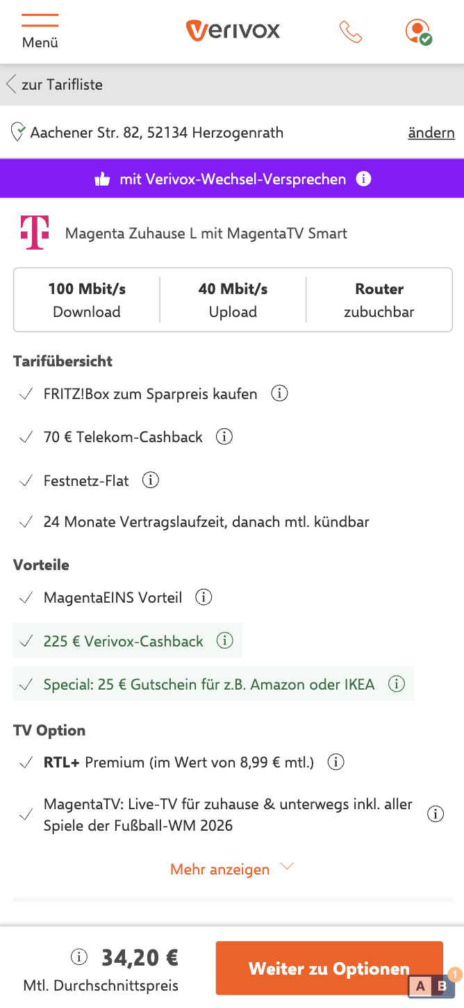
User feedback described the Offer Page as unstructured and sparse, with critical info missing. Customers arrived at the second step, the Options page, lacking clarity on all base information about the tariff, the monthly prices and what comes next, creating decision anxiety.
Hypothesis
If we keep key tariff information and the primary CTA persistently visible across the step, users experience less decision friction and progress to checkout at a higher rate.
Scope & Ownership
- Owned Offer + Options funnel optimization end-to-end
- Drove discovery, prioritization, experiment design, and rollout decisions
- Led cross-functional delivery with engineering, UX, research, QA, and BI
We prioritized a persistent basket over broader redesign alternatives because it directly targeted decision friction and could be tested quickly with clear guardrails. We deprioritized lower-confidence visual refinements until core conversion gains were validated.
Strategic Framing
Market Context
The broadband category has high consideration, strong price sensitivity, and low trust in hidden trade-offs. In this environment, reducing ambiguity at decision points is a direct growth lever, not only a UX improvement.
Trade-offs Managed
- Information density vs. cognitive load
- Persistent guidance vs. visual noise
- Desktop flexibility vs. mobile speed and clarity
Experiments & Outcomes
Experiment 1: Offer and Options Page
- Baseline: 10,96% CR
- Improvement: +7,03%
- Statistical significance: >99%
Experiment 2: Desktop Iteration
- Baseline: 14,95% CR
- Improvement: +3,02%
- Statistical significance: 90%
Total Business Impact
- €2.2M net revenue (FY)
Experiment 1: Initial Basket (Mobile + Desktop)
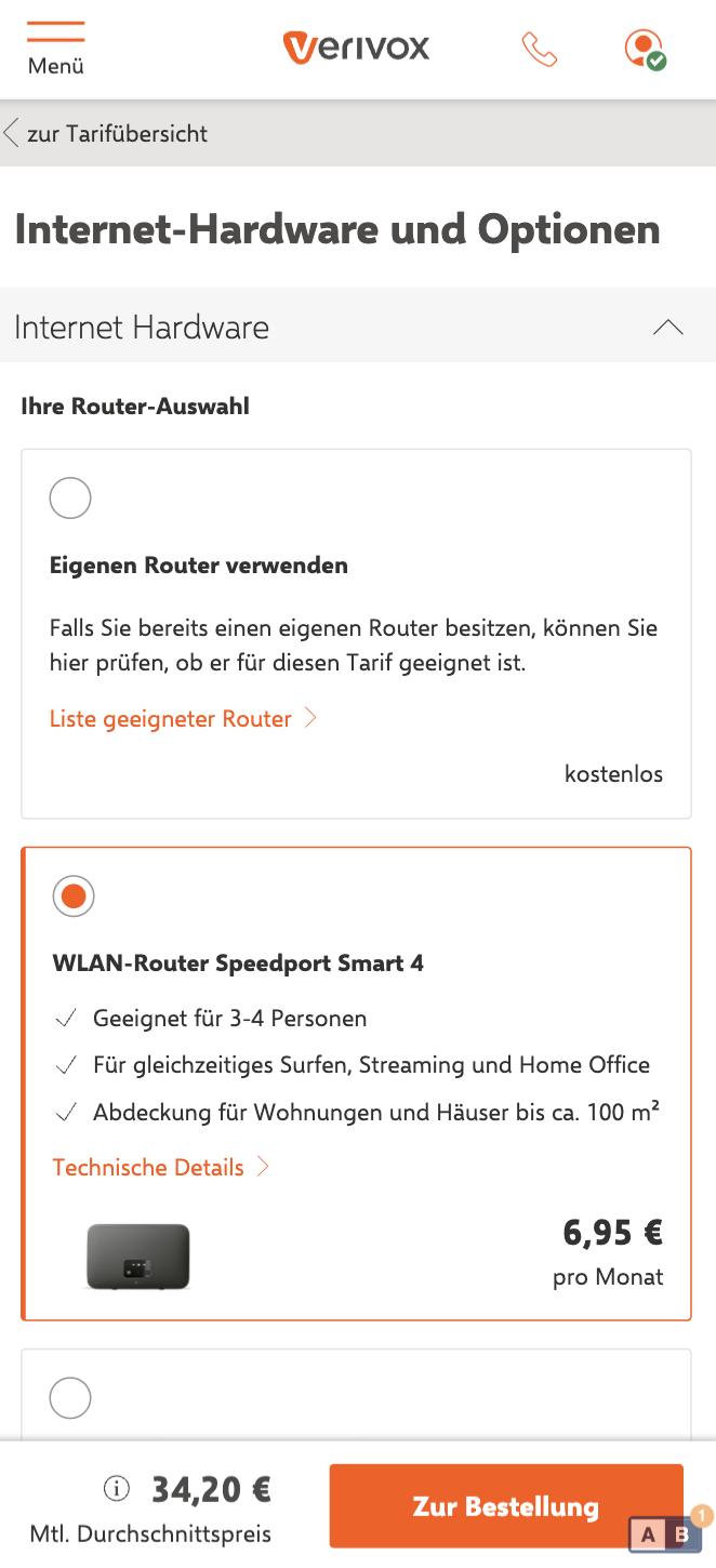
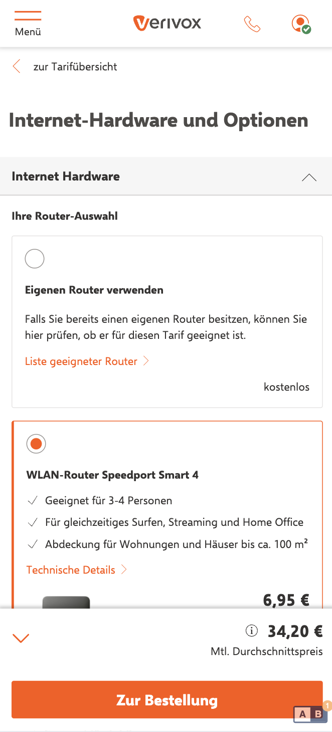
Persistent tariff context and CTA visibility across the step.
Offer Page
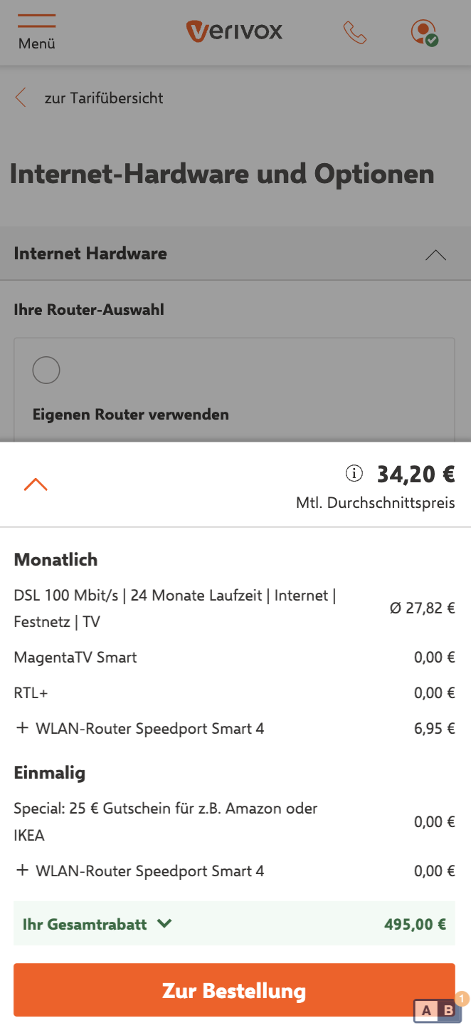
Options Page
🧪 Experiment 1 Result: Baseline 10,96% CR, uplift +7,03%, significance >99%.
Experiment 2: Desktop Iteration
A tighter desktop refinement based on learnings from the initial release.
Iteration Basket Desktop
🧪 Experiment 2 Result (Desktop Iteration): Baseline 14,95% CR, uplift +3,02%, significance 90%.